Alpha Devlog 5: Some UI stuff
A smaller update this time. Between the release of Ero Dungeons and some time getting sapped away by Factorio: Space Age, I only had the time to do some UI work and smaller cleanups. For Ero Dungeons I'm still letting the bugs aggregate a bit and will get out an experimental version (including performance improvements) next week.
UI work
Anyway, when talking about UI work, I don't mean any actual visuals. The visual design of the UI can only be really done once the game's systems are mostly in place. The UI will look like a scuffed version of Ero Dungeons' UI even in the tech demo that will be available to subscribers at the end of November/start of December. Instead it's about tooltips and panels.


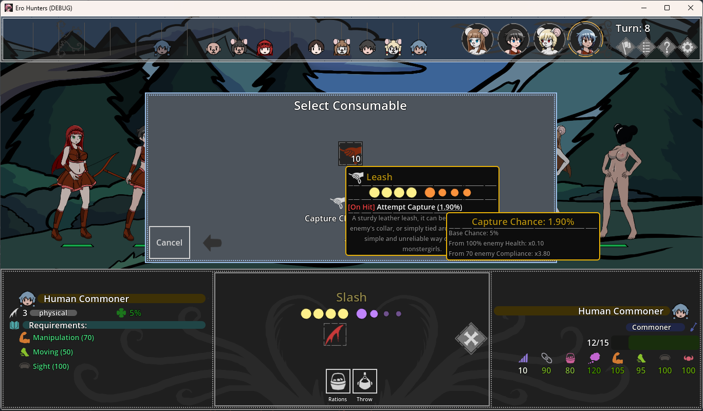
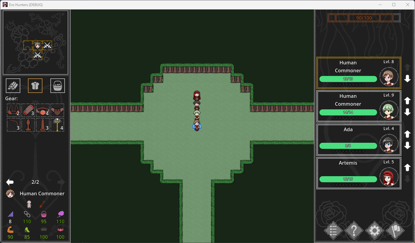
The things I want to talk about are all shown in the two images above.
Pages instead of Scrolling (image 2, left panel)
Scrolling panels are simple. If there's too much stuff on a panel, just add a scrollbar and call it a day. However, this causes two problems.
First, it leads to optimization issues. Once you have 100 adventurers in the guild you will have significant performance issues to setup all of them, even when hidden by a scrollbar. Ero Dungeons used icon caching to fix this. That however came with a huge amount of minor visual bugs which are extremely hard to weed out. It also only works for icons of course.
Secondly, it makes it hard to find stuff. Scrolling through a large list is a pain. Additionally, it is also a problem on mobile where scrollbars are a bit small.
So the game now uses pages instead of scrolling. It's a bit more work to set up, but it works great. It's especially nice if you have a lot of stuff in your inventory.
Infinite Inventory (image 2, left panel)
Darkest Dungeon used its limited inventory to great effect. It made mixing provisions and loot a risk-reward exercise and prevented you from easily getting to much loot and breaking its systems. Ero Dungeons took that system, since that was what Darkest Dungeon did. It had some nice synergies with ponygirls, and also limited gained loot a bit, but it can be a bit of a tedious micromanagement task.
Ero Hunters focuses heavily on crafting your own items and gear. It would be silly if you couldn't take those to dungeons, so you can. In dungeons you have access to all consumables and gear in your inventory. Items you get from the dungeon itself are kept separate and will be lost if you retreat from the dungeon.
Tooltips in Tooltips (image 1)
If you hold a tooltip for a certain amount of time (or press the middle mouse button) it will fix into place. You can then hover over parts of the tooltip to see a further tooltip. The whole subtooltip system is mostly automated, so even if a mod adds 10 new tokens you can hover over those for more information.
Here for example you can see the catch rate calculation and the components that go into it. It's important that this stuff is shown to the player, or you get stuff like Pokemon Red/Blue where Great Balls sometimes are better than Ultra Balls. The more information the player has, the quicker bugs are fixed.
Tooltip Simplifications (image 1)
When a move in Ero Dungeons has an effect, it will most often say "on move performed: on hit targets". This is a very literal translation of the underlying scripting "WHEN:move:HIT_TARGETS", but it occurs so often that it makes sense to change it to "[On Hit]" and list the effects after it. The game now allows to replace such combinations while keeping the fallback description as well (since I'd be making hundreds of custom names otherwise).
Combat Consumables and Actions (image 1, bottom)
Ero Dungeons had a list of all consumables you could use under your move selection. This no longer really works, since you can have infinite consumables and you can also throw all gear you have. So the game now allows for a sort of custom actions for those things.
Get Ero Hunters
Ero Hunters
Catch, Breed, Conquer
| Status | In development |
| Author | Mado |
| Genre | Strategy |
| Tags | Adult, City Builder, Erotic, Hentai, Monster Girls, No AI, NSFW, Porn, Turn-Based Combat |
More posts
- Public 0.6: Laws and Gear5 days ago
- Version 0.5.8: Enemy Update12 days ago
- Version 0.5.7: Backlog19 days ago
- Version 0.5.6: Bugs and Mods26 days ago
- Version 0.5.5: We're so back33 days ago
- Preproduction of Ero Slayers40 days ago
- Roadmap to Completion47 days ago
- Version 0.5.4: New Game Settings54 days ago
- Version 0.5.3: More Laws61 days ago
Comments
Log in with itch.io to leave a comment.
I played his other project "ERO Dungeons" and I loved him a lot, his work is admirable and I am sure that this new project of yours will be amazing, I will be waiting for it. Thanks for everything you do.
I have always loved these types of games they always have so much effort and charm to them and most of the time are more fun than any mainstream game because they are not restricted by most bs and the creators have no need to rush. I can't wait to see what new ways we can corrupt are companions and village or town or guild. hope it all goes well for you guys.
I really love the idea of this new gameplay loop, I always felt like the gameplay loop of the past two games made me want to avoid the sexual content to win, but in this one it sounds like the sexual content is necessary to progress.
I wish you the best of Luck with your new project!
The new game team member is not more lovely than the ero dungeon. Maybe the ero dungeon's character drawing style is much better.
Nested tooltips is something I've been missing from Ero Dungeons, great addition!
try not to change the characters too much, what is already in the game has it's charm.